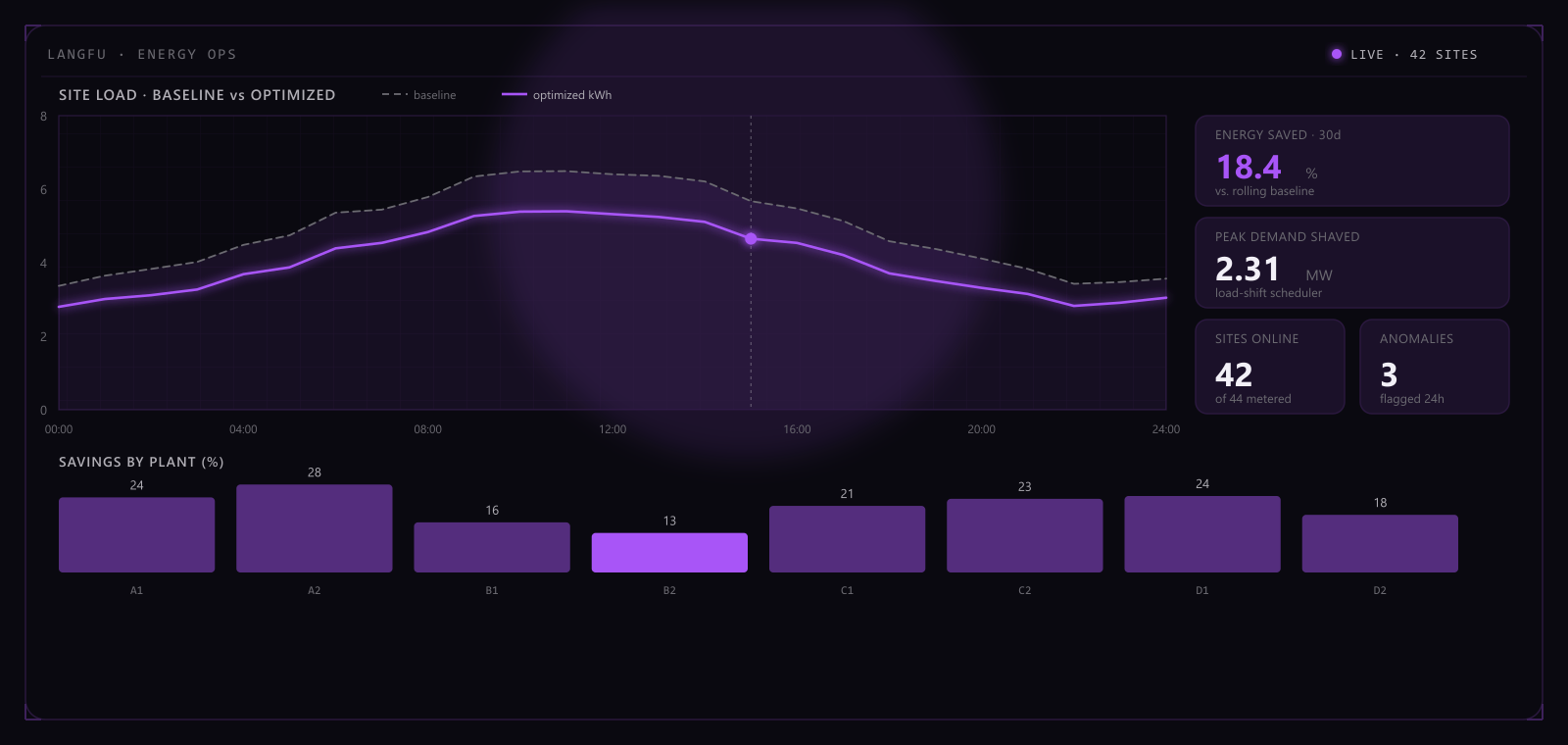
Langfu is an energy-efficiency company, and its site had to serve Chinese and English audiences at once without collapsing into a templated brochure — it had to hold up to scrutiny the way the company's own engineering does.
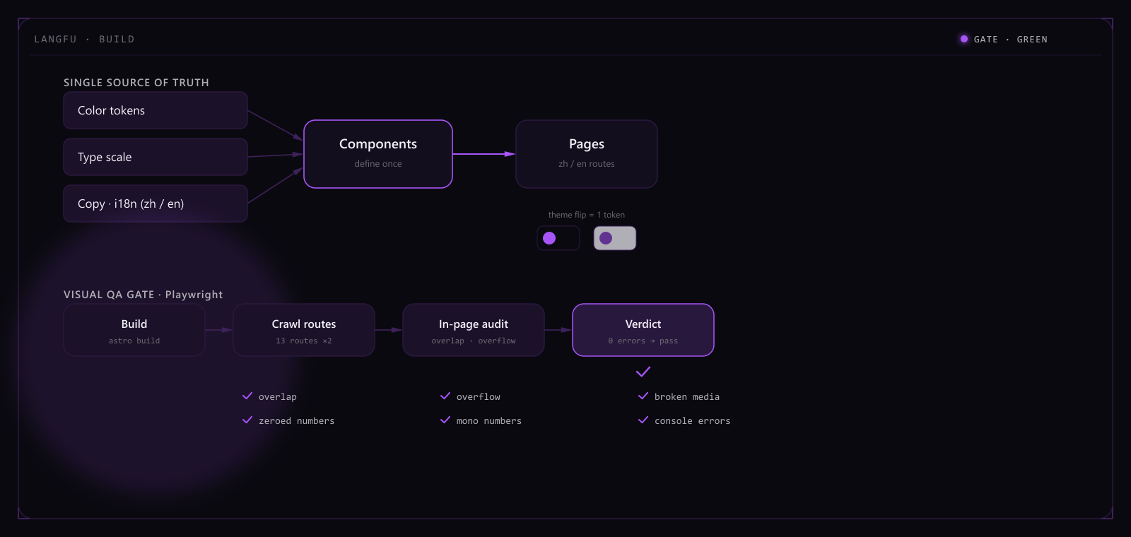
I built the whole thing single-source: color, type, copy and components each defined once and imported everywhere, with dark and light as a single token flip; the two languages run as paired routes, every page aligned across locales. The hero isn't an off-the-shelf library but a bespoke generative thermal-flow, so the first screen reads as a living instrument rather than a static banner.
It ships on a Hong Kong server behind Caddy's automatic, auto-renewing HTTPS, and scores a clean 100 across Lighthouse performance, accessibility, best-practices and SEO on desktop. What matters more is turning "looks good" into something regressable — a Playwright visual pipeline catches overlap, overflow, broken images and zeroed numbers on every build, so the layout accidents an eye would miss are caught first by code.
That discipline wasn't a one-off. The Kikoman site you're reading is a fork and re-theme of this very design kernel — the same skeleton with a new brand color and content, a few tokens away from being a different site. This is where the rigor first proved itself a portable asset, not just one project's finishing touch. Full fork log →
Highlights
- Single-source architecture — color / type / copy / components defined once, AI-maintainable
- Playwright visual gate auto-catches overlap, overflow, broken media, zeroed numbers
- Dark / light theme via token flip — define once, the whole site adapts